A Complete Guide to Sticky Bars (Tips, Code & Examples)
Ever been on a website and noticed a sleek banner that follows you as you scroll? That’s a sticky bar.
It’s a simple but mighty tool. Its job is to keep your most important message front and center, without getting in the way.
What Exactly is a Sticky Bar?
A sticky bar is a banner that “sticks” to the top or bottom of a webpage.
No matter how far a visitor scrolls, that little bar stays visible. It gently reminds them of something you want them to see or do.
You might be thinking, “Isn’t that just the main menu?” Not quite. It’s easy to confuse a sticky bar with a fixed header.
A fixed header is your entire navigation menu (Home, About, Contact). It locks to the top so you can easily get around the site.
A sticky bar is a smaller, focused strip. It’s not for general navigation. It has one specific job, like announcing a sale.
Common Types of Sticky Bars
So, why should you use one? Think about the single most important thing you want visitors to do or see on your site. A sticky bar is designed specifically for that. It cuts through the noise and keeps your main goal in the spotlight.
Generally, sticky bars are used for a few main reasons:
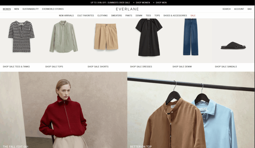
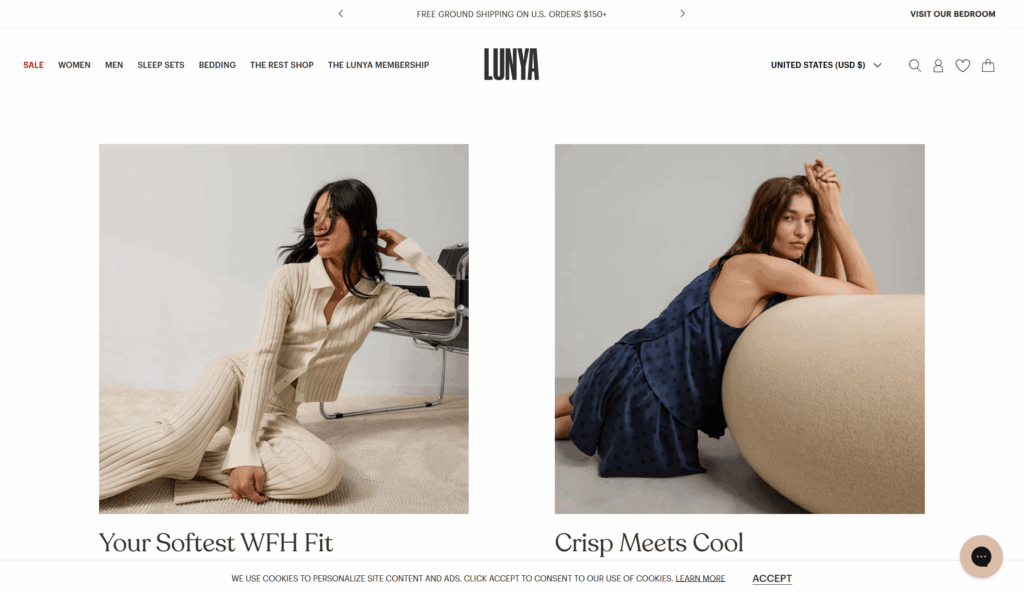
- Sales & Deals : This is the most popular type. It shouts out a special offer like “Free Shipping!” or “20% Off Today!” to encourage visitors to buy something.
- Email Sign-ups: A simple bar that asks for your email in exchange for a newsletter or a discount.
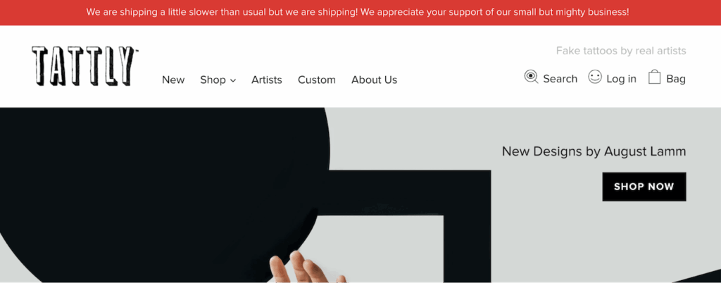
- Important Announcements: Used for site-wide news, like “We’ll be closed for the holiday” or “Expect shipping delays.”
- Cookie Notices: The bar at the bottom of a site asking you to “Accept Cookies.” It’s often required by law.
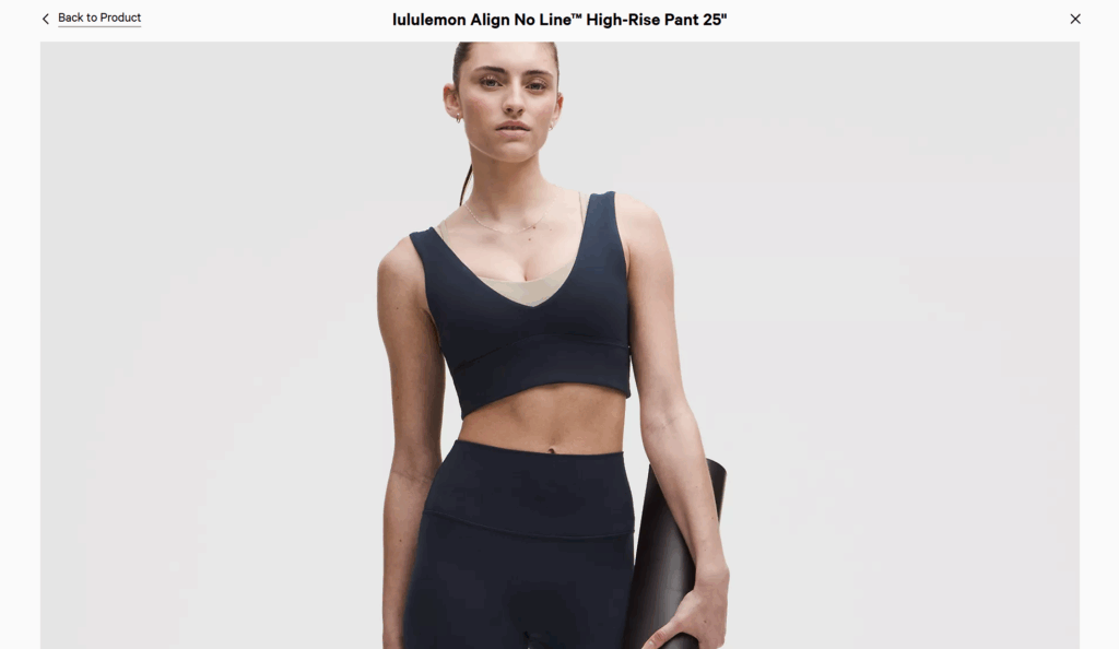
A savvy web designer thinks beyond these conventional uses and implements sticky bars thoughtfully where they can genuinely improve the user experience. For example, on Lululemon‘s website, when a user clicks to view a full-screen product image, a contextual sticky bar appears to display the product’s name, ensuring the user never loses track of what they are viewing.
Golden Rules for Using Them
The goal is to be helpful, not annoying. Here’s how:
DO:
- Keep it small. A sticky bar should be a thin strip, not a giant banner. It shouldn’t block what the visitor came to see.
- Have one clear goal. Don’t ask people to sign up, shop a sale, and follow you on social media all in one bar. Pick one thing and make the button for it obvious.
- Make it easy to close. If the bar design is a bit distracting, include a clear ‘X’ so people can dismiss it if they aren’t interested.
DON’T:
- Make it hard to read. Use simple text and colors that have good contrast (like black text on a white background, not light grey on white).
- Forget about mobile users. Test it on a phone! A bar that looks fine on a big computer screen can cover half the page on a small phone.
- Use too many pop-ups. If you already have a chat box and other pop-ups, adding a sticky bar can make your site feel cluttered and spammy.
In short, a good sticky bar gives visitors important information without getting in their way.
How to Add a Sticky Bar to Your Website (CSS-Only Method)
If you want a simple announcement bar, you don’t need to install an app. The approach I am sharing is lightweight and very easy to implement by adding a little HTML and CSS.
Important First Step: Before you edit any code, always create a backup of your website! For Shopify, duplicate your current theme. For WordPress, use a child theme. This ensures you have a safe version to restore if anything goes wrong.
For Shopify
You can add a sticky bar by making two small edits to your theme code.
1. Add the HTML Structure
- From your Shopify admin, go to Online Store > Themes.
- Find the theme you want to edit, click the three-dots icon (…), and select Edit code.
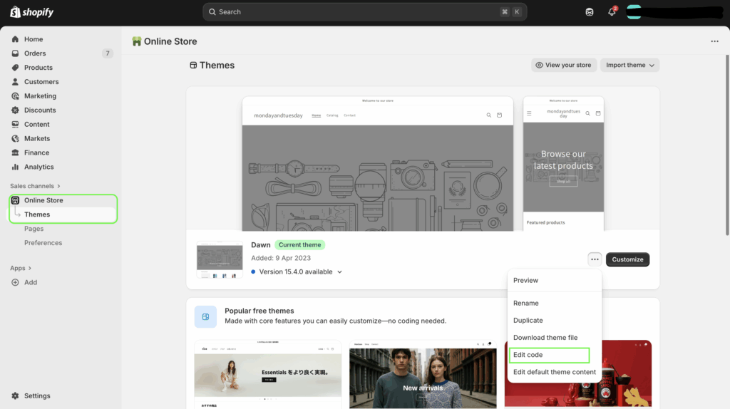
- In the file list on the left, find the layout section and open the
theme.liquidfile.
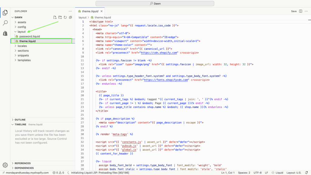
- Find the opening
<body>tag. Directly below it, paste the following HTML code:
<div id="my-sticky-bar">
  <p>✨ Get free shipping on all orders over $50! ✨</p>
</div>
2. Add the Styling (CSS)
- In the file list, find your theme’s main CSS file. It’s usually named
base.css, and it is under the assets section. - Scroll to the very bottom of this file and paste the following CSS code. You can change the
background-colorandcolorvalues to match your brand.
#my-sticky-bar {
  background-color: #2c3e50; /* A dark blue-gray */
  color: #ffffff; /* White text */
  padding: 12px 15px;
  text-align: center;
  position: sticky;
  top: 0;
  z-index: 1000;
  width: 100%;
}

#my-sticky-bar p {
  margin: 0;
}
- Click Save. That’s it! Preview your store to see your new, permanent sticky bar.
For WordPress
This method involves using the WordPress Theme Customizer and the Theme File Editor. Using a child theme is highly recommended.
1. Add the HTML Structure
- From your WordPress dashboard, go to Appearance > Theme File Editor.
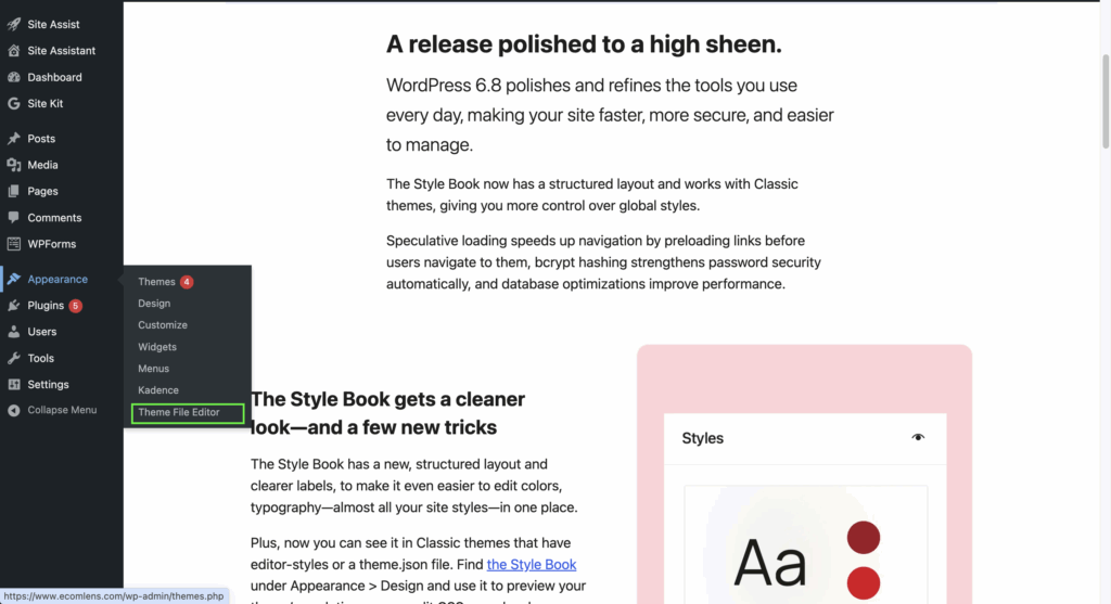
- On the right side, find and click on the
header.phpfile.
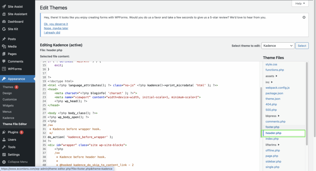
- Locate the opening
<body>tag (it might look like<body <?php body_class(); ?>>). - Directly below that line, paste this HTML code:
<div id="my-sticky-bar">
  <p>🎉 Sign up for our newsletter and get 10% off! 🎉</p>
</div>
- Click Update File.
2. Add the Styling (CSS)
- The safest place to add CSS in WordPress is the Customizer.
- Go to Appearance > Customize.
- Select the Additional CSS tab.
- Paste the following CSS code into the text box:
#my-sticky-bar {
  background-color: #2c3e50; /* A dark blue-gray */
  color: #ffffff; /* White text */
  padding: 12px 15px;
  text-align: center;
  position: sticky;
  top: 0;
  z-index: 1000;
  width: 100%;
}

#my-sticky-bar p {
  margin: 0;
}- Click Publish. Your permanent sticky bar is now live on your WordPress site.
Final Thought
There you have it. The sticky bar is more than just a design element; it’s a smart, simple tool for communication and conversion.
It strikes the perfect balance—less intrusive than a pop-up but far more visible than a standard header link. Whether you’re announcing this weekend’s flash sale or growing your newsletter, a thoughtfully designed sticky bar keeps your goal in sight and helps turn visitors into customers.
FAQs
Q: Should my main navigation bar be sticky?
A: Yes, in most cases, making your main navigation bar sticky is a great idea. While you don’t want every element on your page to stick, a fixed navigation menu significantly improves user experience.
The benefits are clear: it provides constant access to site pages, saving users from the frustration of scrolling all the way back to the top. It also keeps your brand logo visible at all times. For most e-commerce or content-heavy sites, a sticky navigation is a smart move for usability.
Q: Can a sticky bar be animated?
A: Yes, a sticky bar can be animated, but it’s crucial to do it thoughtfully. Using CSS, you can add simple effects like having the bar slide down or fade in when the page loads.
The key is to keep animations subtle and quick. Overly complex or slow animations can become distracting and harm the user experience rather than improving it. The goal is to gently draw attention to your message, not to create an annoying distraction for your visitors.
Q: Can I have more than one sticky bar on a page?
A: While you technically can, it is strongly advised not to. Using more than one sticky bar clutters the interface and significantly reduces the available screen space for your content. This creates a poor user experience, especially on mobile devices, and can make your site feel spammy. For maximum impact and a clean design, stick to just one.